
At this point, I think we can all agree that the American healthcare system has been discussed, dissected, criticized, and compared to just about every other healthcare system on the planet, almost ad nauseum. However, with the first major set of changes from the ACA set to take effect at the beginning of next year (just three and a half months from now), it’s never a bad idea to revisit these issues to reminded of our healthcare inferiority and thus be inspired to make our system better. Or something.
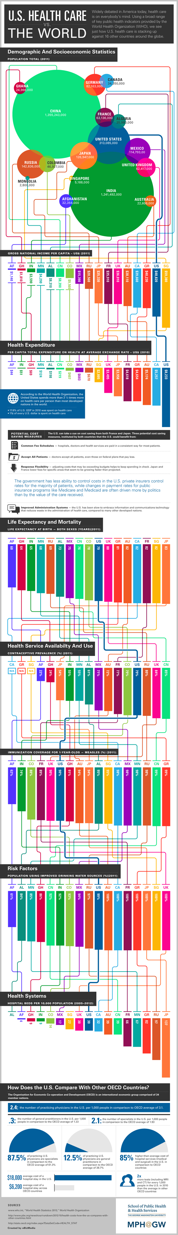
The following infographic has been created and circulated by George Washington University’s online MPH program. It was created with data from the WHO’s World Health Statistics 2013 report and compares American economic, health, and healthcare statistics with a handful of other countries. It’s a large image with a lot of information and can take a bit of time to digest. We have seen several of the metrics before (like here and here), and I am not quite sure why certain countries were selected (seeing Mongolia and Ghana in the array left me scratching my head a bit) – personally, I feel like it is more useful to compare America to countries with a similar population or economic size, or level or development. Nonetheless, it provides additional perspective.